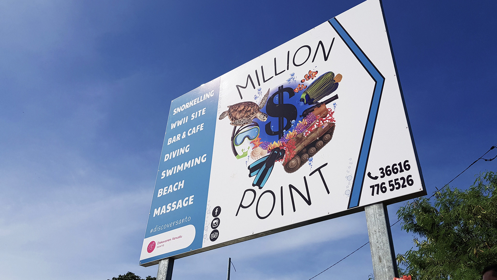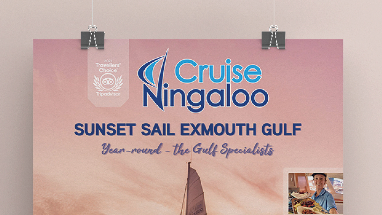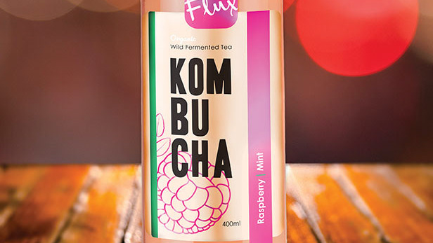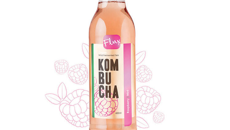
This tour company asked for a rebranding of their logo that was relaxed and
fun like their snorkel tours, while highlighting some of the star attractions of
the Ningaloo Reef - the wildlife. A fun play with letters and shapes to give the
feeling of what the business and the ningaloo reef are about, worked in this case.
Keeping it clean and not too busy was key. The colours Yellow and blue were from
their previous logo and they felt keeping it recognisable was important.