This massage and retail hub needed a full rebrand to really represent their growth after 10 years in operation.
Website, logo, shopfront signage, instagram tiles & Highlight icons, facebook header, printed menus, gift certificates, business cards.
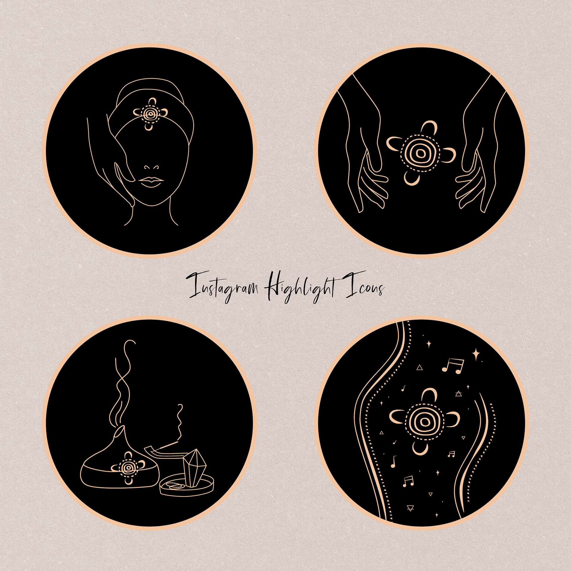
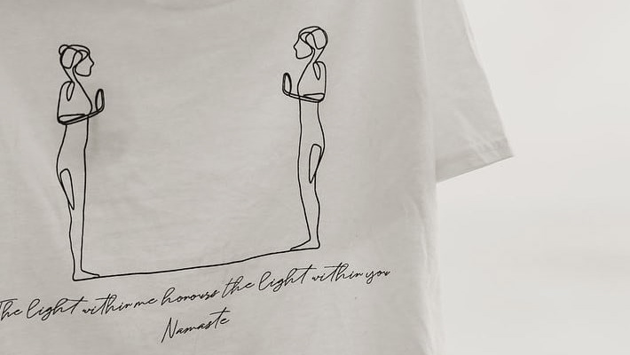
Their new logo represents the play between light and dark and masculine and feminine in all of us. The symbol in the center is inspired by an Australian Indigenous artwork meaning 'a meeting place', with the dotted lines surrounding symbolising 'sunrays', which are a reflection of the land of eternal sunshine in which they are based (Exmouth, WA). Their healing hub is a meeting place of practitioners and anyone on their healing journeys to better health and vitality, physically or spiritually. The complete circle around the outside lends trust and accountability to show up for each client's needs.
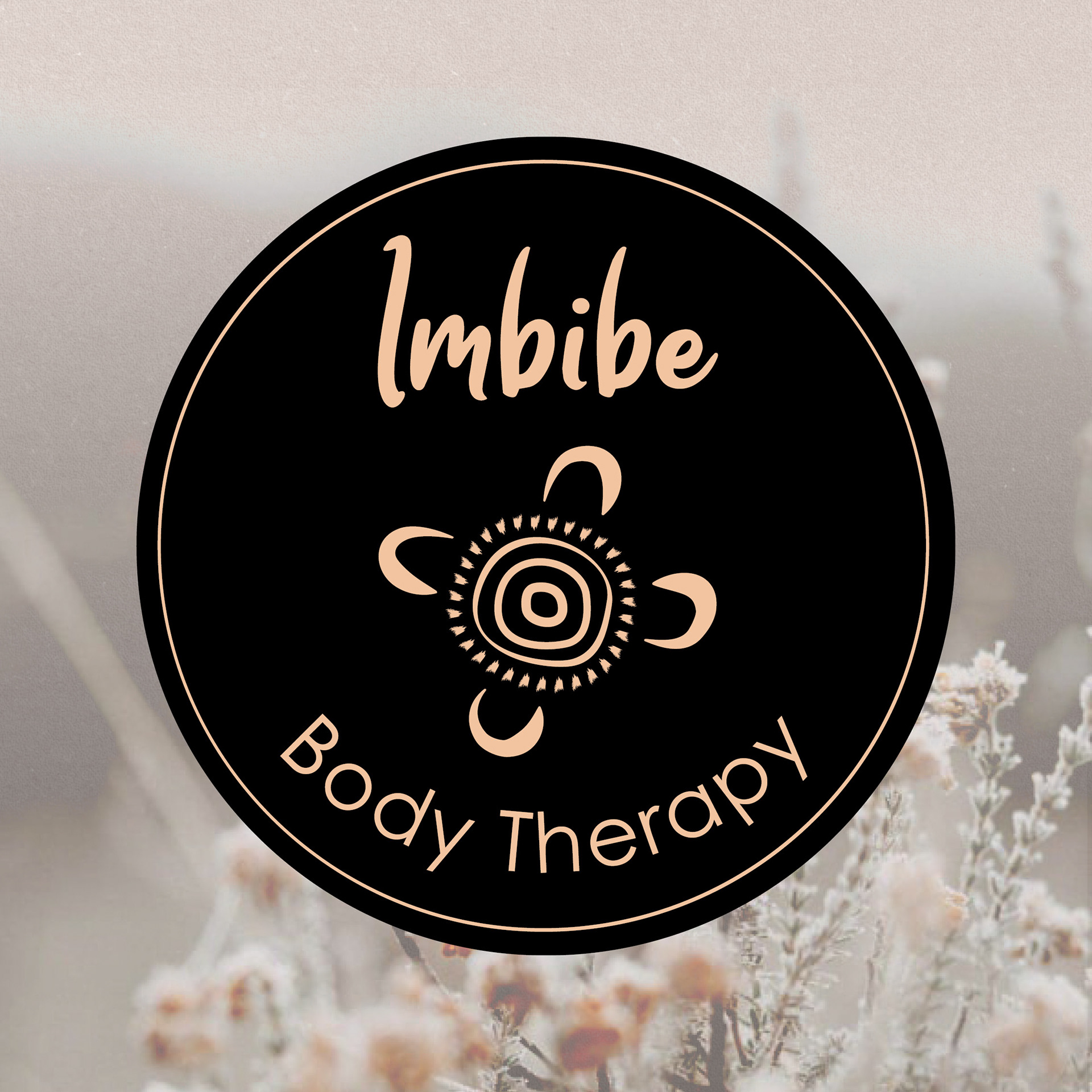
Final Logo
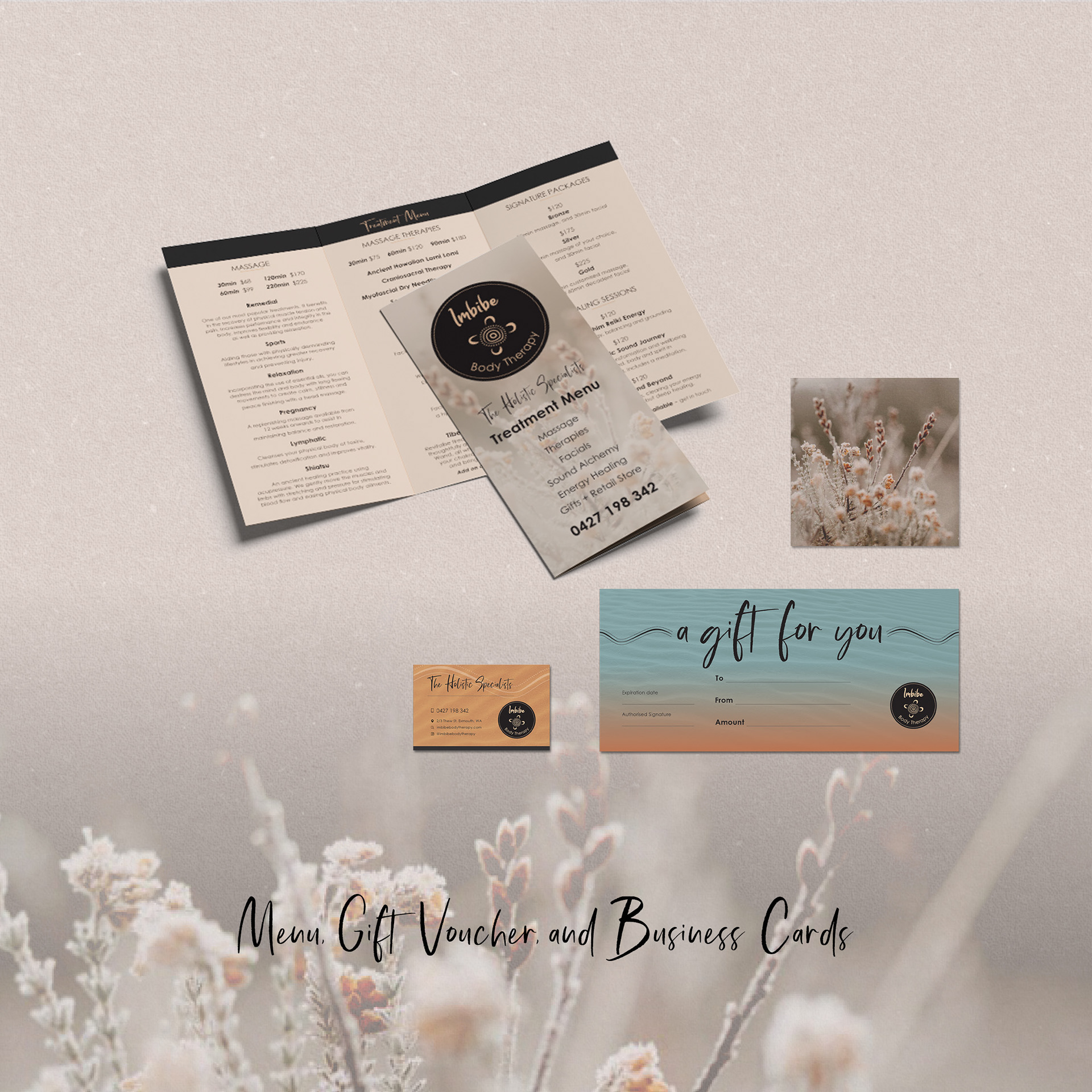
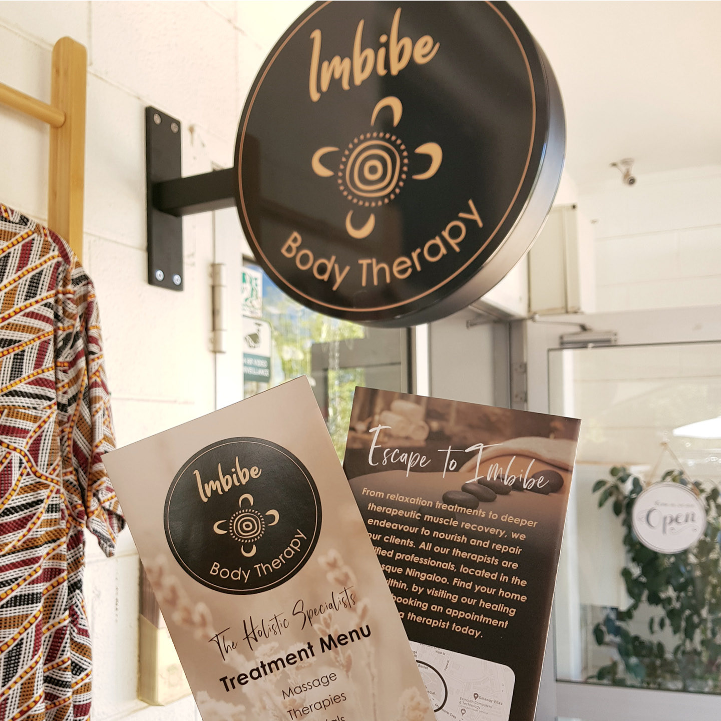
Shopfront Signage and Menus

Insta campaign to start their new look and feel